
Blog
All about Tech Industry


Creating a Single Website for Four Languages Including Arabic
UI/UX Design
Published by Antartech
Monday, 3 August 2026
Why Arabic reads right to left (and why it matters for your UI)
Before we get into the how, it helps to understand the why.
Arabic script has been written right to left for over a thousand years. It's one of the world's oldest continuously used writing systems and the direction isn't arbitrary. The flow of Arabic calligraphy, the way letters connect, the natural movement of the hand writing with ink are all from right to left. This isn't just a technical setting you toggle. It's how over 400 million native speakers process visual information every single day.
That means when an Arabic reader lands on your website, their eyes start at the top right. They scan right to left. They expect the most important action on the right side. "Forward" means moving left. "Back" means moving right. It's the complete opposite of what English-first interfaces assume.
If your UI ignores this, you're not just creating a visual inconvenience, as if you're fighting against deeply ingrained cognitive patterns. It's like asking an English reader to start every page from the bottom-right corner. Technically possible but practically exhausting.
The real problem isn't translation, it's the layout
When we built the MGW Express site, we needed to support four languages. Three read from left-to-right, but Arabic reads right-to-left. That single difference touches everything: where the menu sits, which way arrows point, and how users scan the page.
Here's what the typical fix looks like:
Build the site in English → Finish it → Hand it to a developer to "flip" for Arabic → Create a separate stylesheet that mirrors every component → Ship two parallel layout systems → Pray they stay in sync.
It works until the third update. Then the Arabic version starts drifting. Buttons break. Spacing looks off.
Therefore, We took a different approach.
One system, four languages, zero overrides
Instead of thinking in "left and right," we built the entire design system around "start and end."
What does that mean in practice? Every spacing decision, every alignment rule, every directional element in the system doesn't say "push this to the left." It says "push this to the start." When the page loads in Arabic, the browser knows that "start" means the right side. In English, it's the left. Same instruction, different result automatically.
No separate Arabic stylesheet. No mirrored components. No duplication. When we update something once, it works correctly in all four languages.
Before: Four layout systems slowly falling out of sync. After: One system that adapts to any reading direction at runtime.
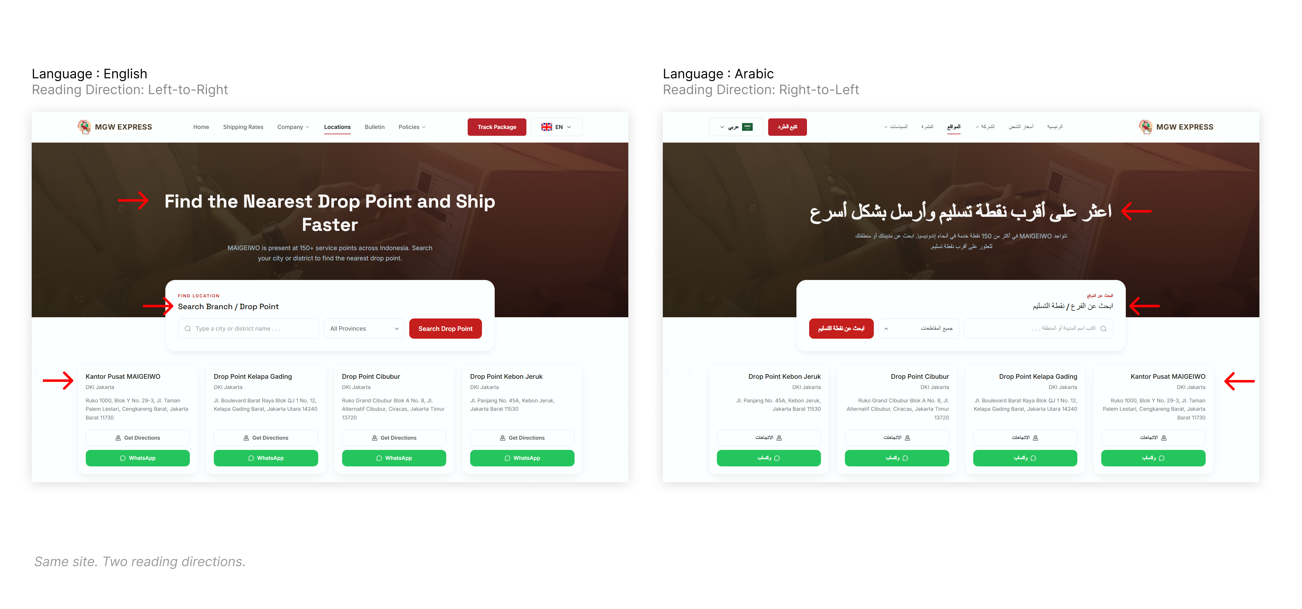
Here's something most teams overlook: Arabic pages aren't purely right-to-left. They're full of left-to-right islands including tracking numbers, shipment IDs, timestamps, brand names in English, URLs.
If you don't handle these mixed-direction strings carefully, the results break in the exact places users trust most. A tracking number renders out of sequence. A date reads backwards. These aren't cosmetic glitches, instead they're trust bugs. In logistics, where users are checking shipment status, that's a serious problem.
Best practices: What to flip and what to keep
When moving between reading directions, you need clear rules. You can't just flip the whole page and hope for the best. We followed these guidelines to ensure consistency:
What gets mirrored:
| Element | What changes in Arabic |
|---|---|
| Navigation flows | Menu items, breadcrumbs, and pagination reverse to match scan direction |
| Form layouts | Labels and inputs align right; placeholders flow from the right |
| Cards and grids | Reading order starts top-right; first item in a row sits on the right |
| Sidebars and panels | A left sidebar in English moves to the right — where the eye starts |
| Progress indicators and steppers | Steps flow right to left; Step 1 sits on the right |
| Directional icons | Forward arrows, next chevrons, reply, undo/redo flip with reading flow |
| Sliders and range inputs | Minimum on the right, maximum on the left |
| Tables | Column order reverses; the first (most important) column sits on the right |
| Tooltips and popovers | Anchor to the logical start side of their trigger |
| Scroll direction cues | Horizontal carousels and swipe indicators follow reading direction |
What does NOT get mirrored:
| Element | Why it stays as-is |
|---|---|
| Phone numbers and math | Numbers always read left to right, even inside Arabic text |
| Logos and brand marks | Visual identity, not a directional element |
| Media playback controls | Play, pause, FF/rewind follow universal media conventions |
| Clocks and analog time | Hands always move clockwise |
| Maps and geographic visuals | North stays up; east stays right |
| Non-directional icons | Search, settings, heart, trash — no reading direction implied |
| Checkmarks and close (X) | Universal symbols; don't flip |
| Images and photographs | Stay as-is unless the image has directional narrative (e.g. a comic) |
| Video content | Players and footage keep original orientation |
| Code and technical strings | Code, URLs, file paths, and emails always read left to right |
Typography deserves its own attention
One more thing teams often miss: Arabic script at the same technical size as Latin text often looks smaller. The letterforms are more complex, with more dots and diacritical marks competing for space.
Best practice: give Arabic typography its own sizing and line-height values at the design-system level. Don't just translate the words, but make sure they're equally readable. Your Arabic readers deserve the same comfortable reading experience as your English readers.
What this means for your next project
If Arabic, Hebrew, Persian, or any RTL language is on your roadmap, here's what we've learned:
Baking direction-awareness in from the start is dramatically cheaper than retrofitting it later. We're talking roughly 3x the effort to bolt it on after the fact and the result is always more fragile.
The companies that win in multi-market expansion aren't necessarily the ones with the biggest teams. They're the ones who build systems that scale to new markets without multiplying their maintenance burden.
That's what we built for MGW Express. One frontend. Four languages. Two layout directions. Zero layout overrides.
MGW Express is currently in active development. We're building multi-market frontends where every language and every reading direction is a first-class citizen.
[Let's talk about your next multi-language project →]
📧 hello@antartech.co 🌐 antartech.co
Related Articles

UI/UX Design
Bento Grids: Why Every App Looks Like a Japanese Lunchbox
If you have browsed a modern SaaS landing page, explored an AI tool dashboard, or scrolled through design portfolios on Dribbble recently, you have probably noticed a major…
UI/UX Design
Creating a Single Website for Four Languages Including Arabic
Why Arabic reads right to left (and why it matters for your UI) Before we get into the how, it helps to understand the why. Arabic script has been written right to left for over a…

Logistics
Getting Paid on Time (Without Chasing Anyone)
Part 3 of 3: Building a Digital Backbone for Export Logistics Reading time: 8 minutes Series: From Spreadsheets to Systems, A Logistics Transformation Story Catching up? Read Part…

Logistics
From Tracking Numbers to Real-Time Visibility
Part 2 of 3: Building a Digital Backbone for Export Logistics Reading time: 7 minutes Series: From Spreadsheets to Systems, A Logistics Transformation Story Missed Part 1? Read…

Logistics
How We Replaced 47 Excel Spreadsheets with One Smart Pricing Engine
How We Replaced 47 Excel Spreadsheets with One Smart Pricing Engine Part 1 of 3: Building a Digital Backbone for Export Logistics Reading time: 7 minutes Series: From Spreadsheets…

UI/UX Design
3 Essential Figma Plugins to Streamline Your Design Workflow
In design workflows, the right plugins can save time, reduce repetitive tasks, and keep projects consistent. Here are three plugins that stand out for their practicality and…